Medium’s home page on mobile
You cannot see recent articles when you visit Medium’s homepage on a mobile browser. You absolutely HAVE to sign in to view the homepage with all the recent articles.
Swiggy does not push its mobile app on you
A lot of websites aggressively push their mobile app on you. Like Wroblewski has a few examples here - 1, 2, 3 .
It was a pleasant surprise for me when I used Swiggy on a mobile browser and they didn’t push their app on me in the slightest. It was just exceptionally clean. Is it because they’re so confident in their web flow that they believe there are no real conversion issues even if people use their website? If so, impressive.
Reddit’s settings on mobile-brower
Reddit has a functioning mobile website but when you click on settings, it takes you to the desktop site. Is this an example of the PMs/Designers there simply giving up?
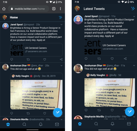
Difference in widths of separation lines
The separation lines between tweets are thicker on web-Twitter versus mobile-Twitter. I like the thinner ones and I have a strong hunch that it is that way on the web probably because of some arcane browser compatibility issues. For reference, the lines (web) were 3px on a 1080x2160 screenshot and the lines (app) were 1px on 1080x2160.

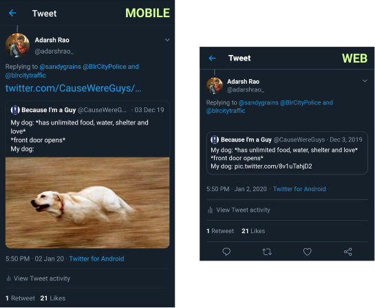
Another link preview inconsistency on Twitter
Inconsistencies in Twitter across the website and the mobile app are driving me crazy. What you see below are the same quote-tweet viewed on a mobile (left) and viewed on a desktop (right). The image does NOT appear in the desktop ruining the experience.

50% off a Coke Zero
Bbinstant is an automated vending machine in my apartment. I got a notification the other day offering me “get 50% off on a Coke Zero”. I assume they were offering me a discount to clear stock that is expiring or is being close to being restocked. I thought that was super cool, how can the local grocery store possibly compete with this.