Figma’s special text-undo
Figma returns your cursor position to the exact position your cursor was when undoing edits to a text. 🤯
I think this struck me with surprise because this is unlike every other application out there. Other applications ( I checked Illustrator, Notion and VSCode) have the entire word selected when you’re undoing a deletion and if you go a step back, they take you to the end of the sentence.
I think Figma takes a risk with each such new altered functionality release. Even if it’s unquestionably better, there definitely are going to be haters. This must be just one of plenty of fresh new ideas they have. I wonder what their Product teams prioritize internally in order to decide which of these new ideas sees the light of day and which don’t.
Figma is my primary design tool now. I struggled to return to Illustrator in part because of changes in expected behavior like this. When your brain internalizes these new patterns, transitioning is mentally jarring.
I think I’ve heard that design/software can’t be a moat for too long. If you figure out something good, other teams with enough funding will just copy you given enough time. But when some of the features are so opionated, copying blindly just doesn’t seem that feasible.
Confusing Spotify Playlists
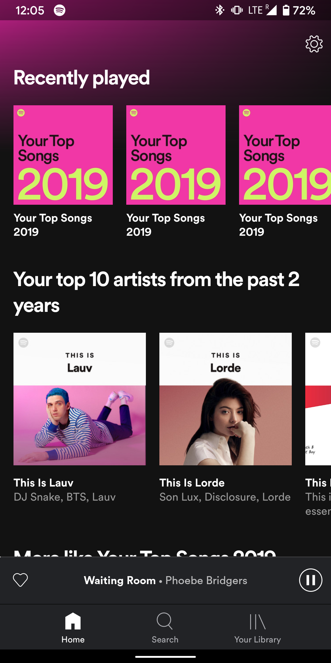
Spotify Wrapped released recently and with it, everyone received a playlist of their top 100 songs. I asked a friend with similar music taste for theirs and followed it. And checked out anothers.
This is what my Spotify looked like. Can you figure out which of these is mine and which of these is my friends?
Seemed strange for an otherwise great launch. I can only imagine that the solution to this problem must have been non-trivial. This is year-3 of Spotify Wrapped, was it the same way the last 2 years too? Does Spotify even consider this to be a problem? Did they think people don’t share playlists around as much and therefore this wouldn’t be as big of a problem?
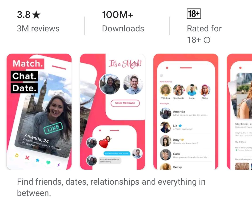
Targeted screenshots on the Play Store
Tinder’s app screenshots are exclusively from a male-perspective. Hinge’s are more equitable.
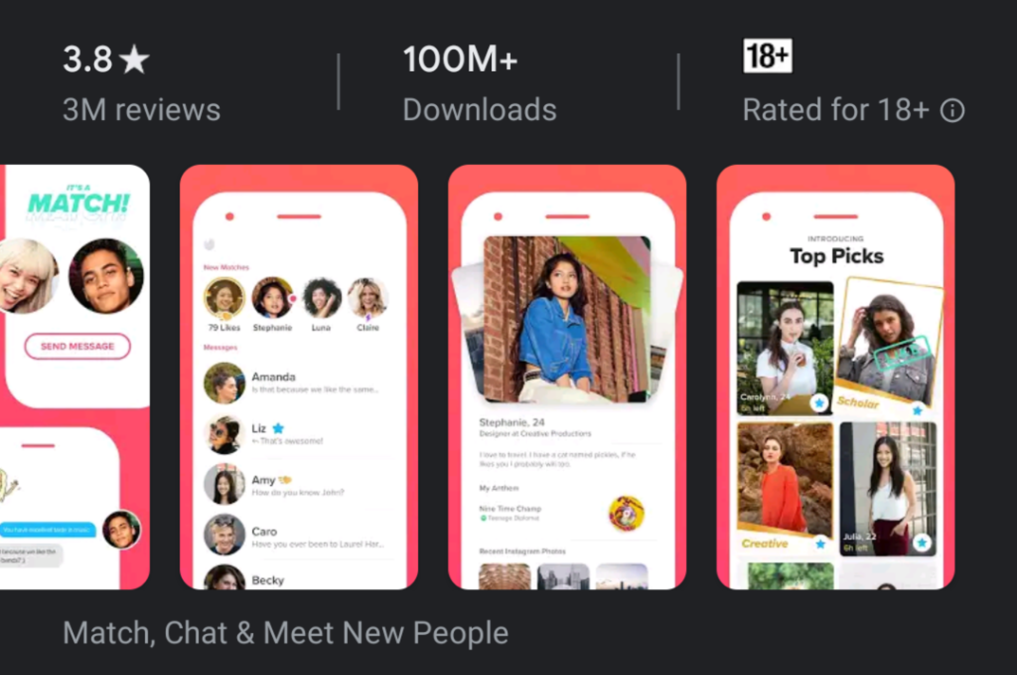
I checked with a couple of friends to see if they had the same screenshots or if they differed for women. They were different for one and not for another. It does not seem gender-targeted but I wonder why the difference. Isn’t the Play Store same for everyone?
Confusing ‘Dismiss’
When I set an alarm on my Pixel, a notification pops up immediately saying an alarm has been set along with a ‘dismiss’ button on it. Except the dismiss turns the alarm off and does not mean ‘dismiss the notification’.
It’s been 6 months now and I still trip up on this.
Also, some 15-20 minutes before the actual alarm, this notification comes up. The intention must have been that ‘hey, this person is awake before the actual alarm. So lets give him an option to dismiss it because he doesn’t need it anymore.’
Except 9 out of 10 times I’ve seen this notification is when I’m in a groggy state BEFORE waking up and dismissed the alarm and ended up over-sleeping because it didn’t ring.
Caption inconsistency on Whatsapp
When you’re sharing an image from say Google Photos to Whatsapp, in the resulting caption area, you cannot enter a new-line. Your message HAS to be in the same line.
But if you type a multi-line message and then attach an image, you enter the same view and you can’t add a new line but the existing multi-lines persist.
I can’t think of a reason why this is the way it is. Also WHAT IS UP with Google hiding necessary actions below the fold and inside of drop-downs? More on this in the next-edition.