Well designed software strives to not make you think[1]. While that’s great for the general public, I think those of us whose job it is to design/build such software need to actively avoid falling for this.
RescueTime tells me I logged 92 hours in front of screens last week.

Think of it as 92 hours interacting with software. What if I got better at making software as a designer with each hour I used software?
It doesn’t happen right now because I default to using software in a daze. I’m typing this on Notion solely focused on getting words out. I don’t care enough about how the interface really works. I’m looking but I’m not seeing.
This series is part of an experiment to force myself to notice interfaces more. The good, the bad and the confusing.
I won’t always have an an opinion or an answer but I expect the very act of noticing these and making a note of them will eventually make me better at noticing things in general and I expect that’s a key skill for anyone looking to build good products.
If you have insights to share on any of these, I’d absolutely love to know . Feel free to email me or DM me on Twitter.
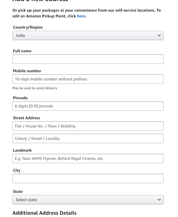
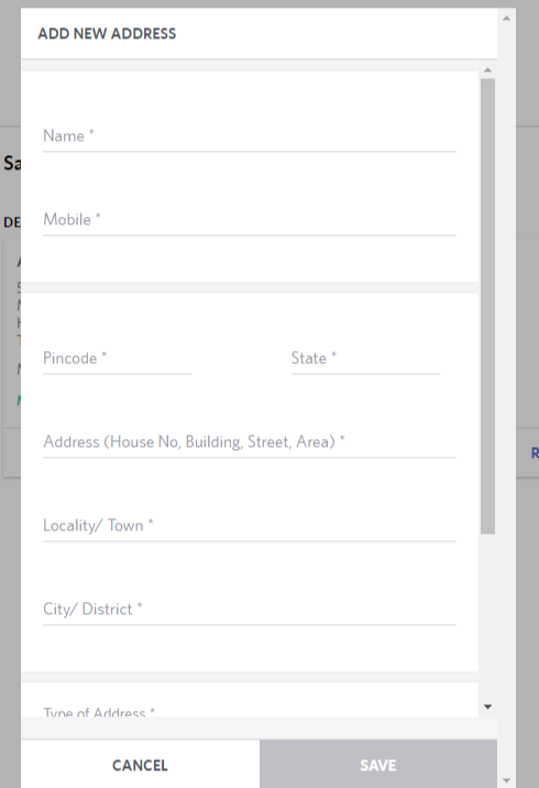
Ecommerce websites never ask you to select your address on a map


That’s Amazon and Myntra.
How do they know where to deliver my package? And how do they do it so consistently? What kind of internal engineering do they have that translates written address to maps. How accurate is it? What does the delivery driver see when he is delivering packages? Is there some kind of feedback mechanism where if one delivery driver figures out where an address is, he can share it with all future delivery guys?
Also, WHY don’t they ask this? Food delivery apps ask this. What is it about ecommerce websites that make them not ask this? Is there any research against them doing this? Something that says that asking users this information causes a drop in conversion values? Something that says people give less than accurate address information when you ask them to do so along with dropping a pin on a map?
Nobody asks for current location when you’re on a browser
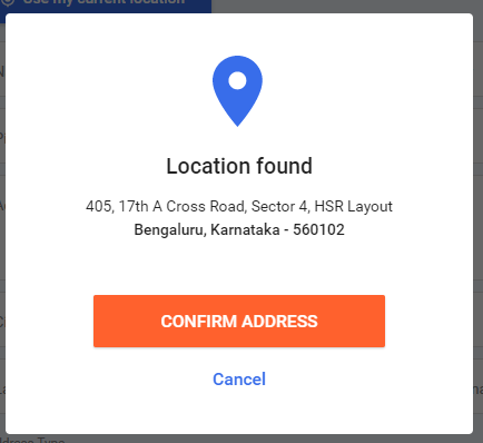
Flipkart doesn’t ask you to select your location on a map either. But they have a ‘Use my current location’ button. Here’s what I get when I click it.

That address is 10km from my actual location. Lesson: Browser locations are unreliable. Do not use them for anything other than a rough idea of where a user lives and even then, not. I wonder if these locations are just as unreliable for other people too or it has something to do with my society having a fibernet conneciton?
High activation energy of changing settings even for pro users
I received the Android 10 update which enabled dark mode for my phone but for some reason my keyboard’s theme stayed white. It was only recently that I got so annoyed by it that I went into settings and changed the theme of the keyboard to be black.
It took me 100+ days to make this switch. Even though I had a rough idea where to find this setting, it still took me extremely long to get annoyed enough in order to do this.
Instagram simply feeling snappier than Twitter
Using Instagram just makes me feel physically lighter than using Twitter. The transitions feel snappier.
Instagram’s design also feels EXTREMELY reliable. It works as expected and that just leaves me feeling good everytime I use it. I know where I am now and I know where I’ll be five-clicks from now. You can feel the state of the app reliably. Comparing this particular aspect to Twitter is unfair because Twitter has varied media while Instagram has largely the same content (images/videos).
The folks over at Ink and Switch have written a really good essay looking at what causes software to be slow.
Notion’s side-bar annoyance.
Notion gives users the ability to hide the sidebar so that you have more real-estate to write. Sounds fine, right? Here’s what actually happens:
This is EXTREMELY annoying. The way windows are stacked right now feels natural to me. The article on the left, the notion page on the right. I read on the left, copy-paste content to the right. But this side-bar forces me to switch the postions. Article on the right, Notion on the left.
How could notion solve it? This problem arises because Notion makes the entire left area hoverable instead of making the users click the hamburger menu at the top. Perhaps they could disable this feature when it recognizes that the window is stacked beside another. Or what if they could detect a moving cursor and depending on the angle decide whether to open the navigation drawer or not. Probably a little too much to ask for, haha.